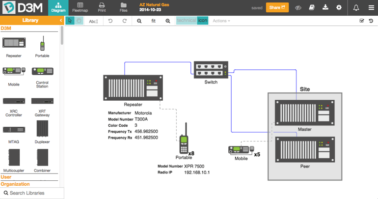
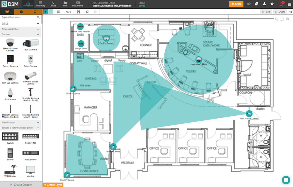
Today is a big day for all of us at D3M. We're excited to announce our new and improved UI (user interface). Available starting today, we hope you enjoy the new D3M as much as we do!
Our developers have been working hard to make D3M easier to use. The new design emphasizes flexibility and makes creating well-organized two-way radio network even easier.
Here are a few of the key changes we think you’re going to love!
- Unified Resource Library - All three of your libraries (D3M, personal & organization) are now integrated into one cohesive scrollable group.
- Increase Flexibility: Re-size your activity feed, task list and resource editor to suit your needs and preferences.
- Live Collaboration Notice: Receive a real-time notification when people view/edit the current project you are working on.
- Larger Workspace: With the ability to hide the Resource Library, you now have more visible canvas space to draw out your network.
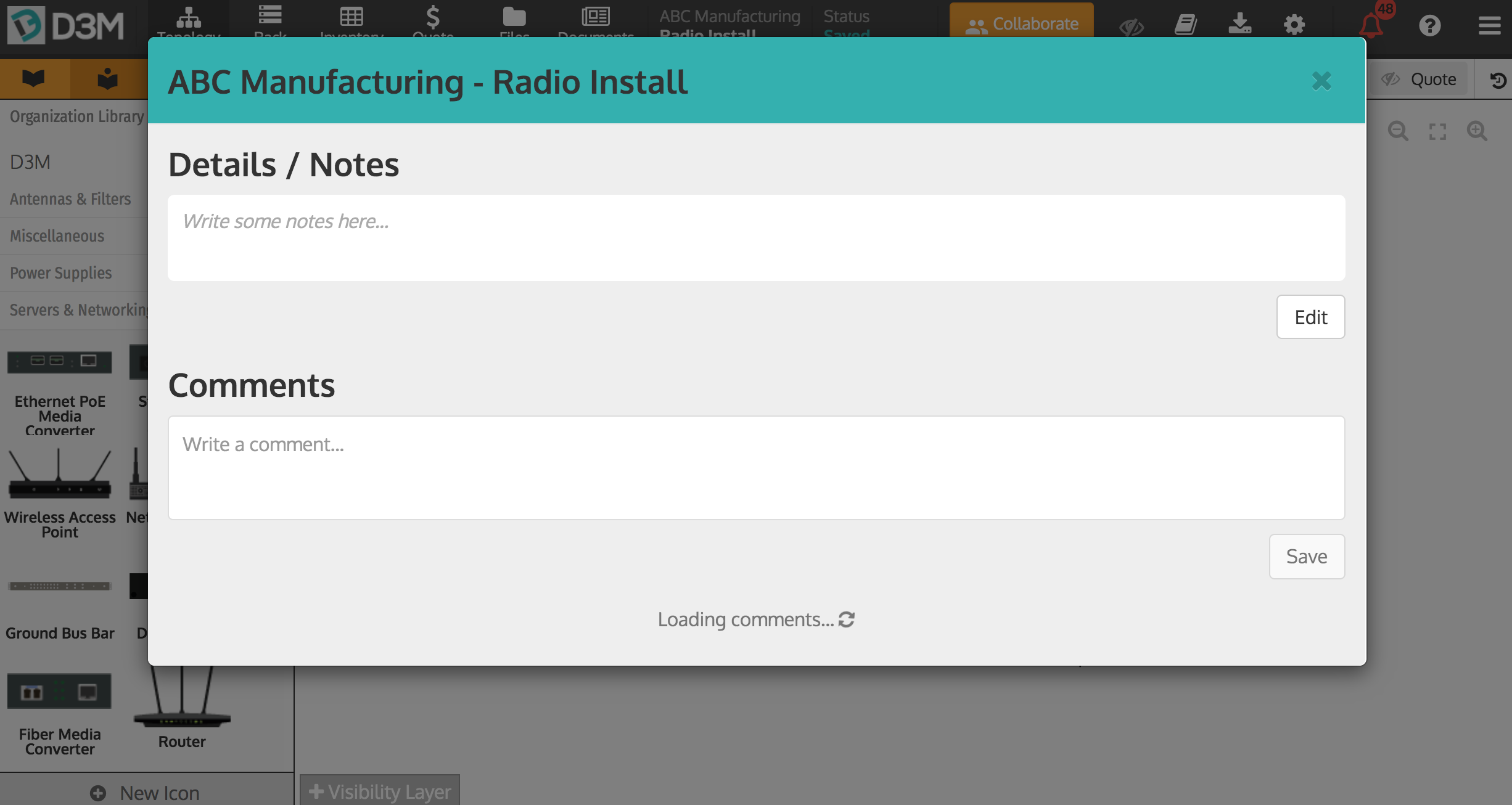
- Resource Editor: Like the Resource Library, the the Resource Editor is now unified in one easy-to-use group.

We hope you enjoy the new D3M as much as we do! And, as always, we would love to hear feedback and suggestions from you on how we can improve D3M even more.


